COVID-19, Death Cases Remain Concentrated: Heritage’s Tracker — and New Graphic Tool — Provide Context

As Heritage Foundation researchers have demonstrated throughout the pandemic, the spread of COVID-19 in the U.S. has been heavily concentrated in a small number of states — and among a small number of counties within those states.
Even though the U.S. saw a rapid rise in cases during June and July, the overall levels of concentration have remained fairly consistent.
As our research has pointed out, state-level figures do not adequately describe the concentrated nature of the spread of COVID-19.
One Percent of Counties Responsible for Half the Covid Deaths
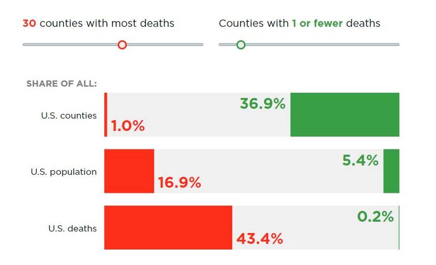
As of Aug. 11, the 30 counties with the most COVID-19 deaths, for example, account for 26% of all the cases in the U.S. and 43% of all deaths, much greater than their 17% share of the U.S. population. That is, just 1% of the counties in the U.S., representing 17% of the population, are responsible for almost half of the country’s COVID-19 deaths.
Of those 30 counties, 23 are in the Northeast corridor between Philadelphia and Boston, the passageway served by a commuter railway system that runs through Manhattan.
Overall, only about 10% of the counties in the U.S. contain 90% of all the COVID-19 deaths, even though these counties include 60% of the population.
Throughout the pandemic, there have been many U.S. counties with relatively few COVID-19 deaths. For instance, as of May 11, 64% of all counties (16% of the population) had one or fewer COVID-19 deaths. As of Aug. 11, 37% of all counties (5% of the population) have no more than one COVID-19 death each.
While these numbers obviously have declined since May, many counties still have a relatively small number of COVID-19 deaths. In particular, as of Aug. 11, 58% of all counties (12% of the population) have five or fewer COVID-19 deaths.
Heritage’s New Interactive Graphic
Heritage’s new interactive graphic allows individuals to see more detail on these concentrations among the counties with the most deaths as well as those with the fewest.
For instance, the graphic allows users to select data from the five counties with the most deaths, all the way up to the 50 counties with the most deaths. It also allows visitors to select data from counties with zero deaths, all the way to counties with 10 or fewer.
Once a category is selected, the graphic provides the percentage of counties represented by the category, the percentage of the population contained in those counties, and the percentage of all U.S. COVID-19 deaths in those counties.
For example, as of Aug. 11, 68.2% of all counties are reporting 10 or fewer deaths. These counties represent 16.7% of the population, and account for only 2.9% of total COVID-19 deaths in the U.S.
In contrast, the five counties with the most COVID-19 deaths represent just 0.2% of all counties, but they account for 18% of all COVID-19 deaths in the U.S., nearly three times their population share of 6.5%.
A list of the 50 counties with the most deaths is also provided, and this list has not changed very much since April. New York, for instance, recorded 32,477 deaths as of Aug. 11.
The five counties of New York City saw 23,561 recorded deaths from COVID-19. Excluding Richmond County (Staten Island), four of these counties are in the top 10 counties with the most recorded COVID-19 deaths. Nassau County in New York also makes the Top 5.
Compared to other places that have been considered hotspots, it is clear that New York City’s outbreak is, so far, much more severe.
For comparison, California recorded 10,650 COVID-19 deaths. Los Angeles County makes the Top 5 of most deaths from COVID-19 at 4,967 deaths, and the greater Los Angeles region recorded 7,257 deaths — less than one-third of the deaths to date in New York City.
Tracking Cases and Deaths
Now that COVID-19 testing has increased dramatically and many state and local governments have relaxed stay-at-home orders, it is even more critical to study the trends in deaths along with cases. To make studying these trends easier, The Heritage Foundation now has two interactive COVID-19 trackers. One tracks trends in cases, the other tracks trends in deaths.
The trackers describe whether the trend of cases — or deaths — is increasing or decreasing over the prior 14 days, and provides a visual depiction of new cases — or deaths — during this time period.
These tools help put the concentrated nature of the pandemic in perspective with county-level data. They show just how difficult it can be to use only one metric to gauge whether a county — or state — is doing well.
Readers are invited to explore the information in the tracker and check back frequently for updates, as well as explore the other visual tools on Heritage’s COVID-19 resources page.
Drew Gonshorowski focuses his research and writing on the nation’s new health care law, including the repercussions for Medicare and Medicaid, as a policy analyst in the Center for Data Analysis at The Heritage Foundation. He also studies economic mobility and the Austrian school of economics.
Norbert Michel studies and writes about housing finance, including the reform of Fannie Mae and Freddie Mac, as The Heritage Foundation’s research fellow in financial regulations. Read his research.
Copyright 2020 The Daily Signal


